Node Properties Panel
Overview
The Node Properties Panel is where you configure the node in your automation flow. Every time you select a node on the canvas, this panel opens automatically to the right, giving you full control over how the node is configured.
Panel Structure
The properties panel is made up of five key sections:
1. Panel Holding Bar
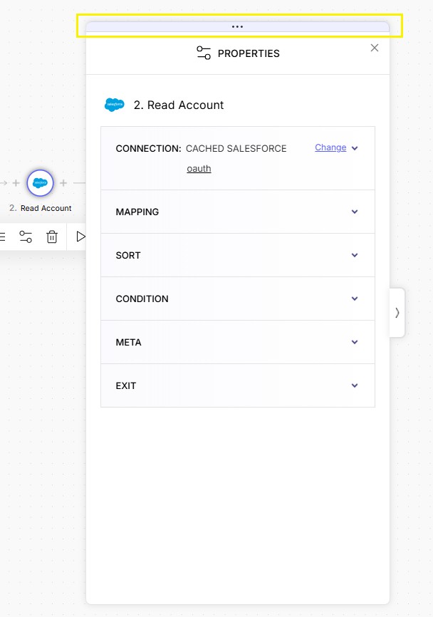
Located at the very top, this light purple strip lets you drag and reposition the panel anywhere on your screen—so it won’t block your view as you work on the flow.
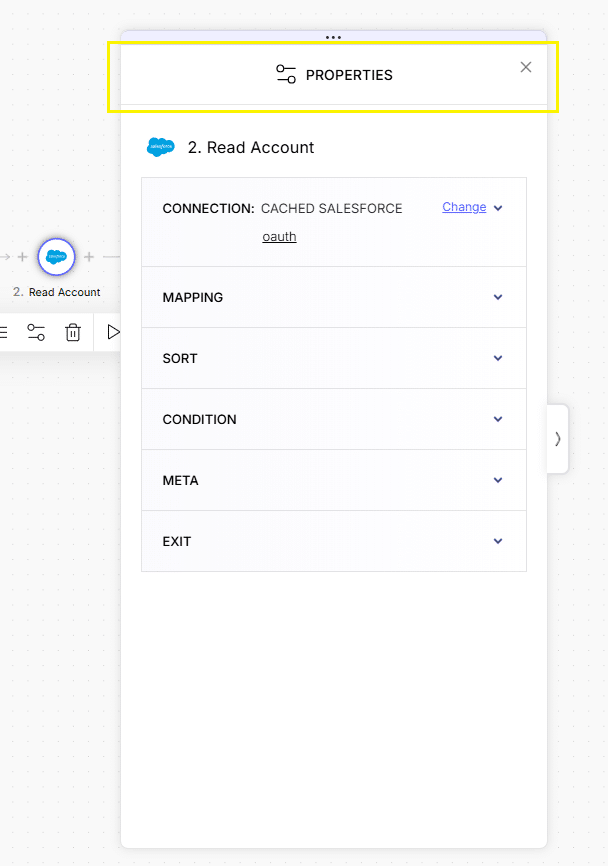
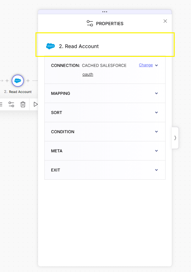
2. Panel Header
Panel name with x close button
3. Node Title
The node’s icon
Service logo or type icon
The node number
Based on its order in the flow: 1, 2, 3…
The node name
Either the service name like Mailchimp, Google Drive, or the type like Condition, Speech to Text, etc.
4. Error Messages
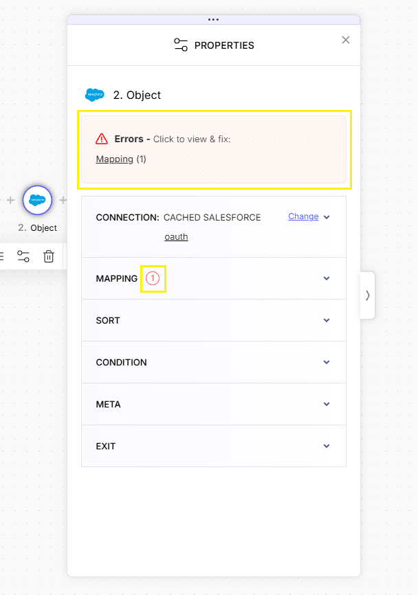
If your node has any issues—missing fields, invalid values, or misconfigurations—you’ll see a pink error box just above the accordion section.
Each message links directly to the relevant configuration section. You’ll also see error counters on the relevant accordion headers to help you find and fix problems faster.
5. Properties Accordion
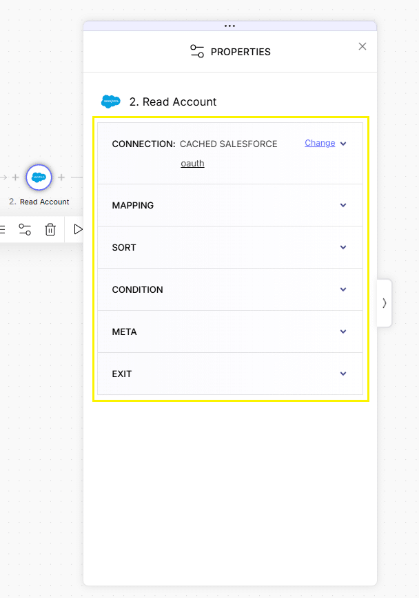
This is the main configuration area, structured as an accordion with collapsible sections.
Each section (called a “category”) holds a specific part of the configuration.
Some categories appear for all nodes, others are specific to certain node types.
Common Categories:
Connection
First thing to set up.
Shows the current connection name and includes a “Change” link to switch or create a new one.
Mapping
Defines how data reaching this node is routed and used in this node service and also later on in the flow. The mapping configurations vary depending on the node service and use case.
It might require you to map methods, actions, objects, fields, etc.
Sort
Lets you sort pulled data by one or more fields, and choose an ascending/descending order for each one.
Condition
Adds logic-based filters that control when the node executes.
Conditions follow this structure:
If [field] [operator] [value], with the option to add more using “AND”/“OR” logic.
Each value includes a kebab menu for:
- Edit
- Format
- Transformations
Meta
Provides a Tag input, allowing you to assign an internal name (tag) to the node for use in later configurations.
Exit
This category refers to rules determining when the node should continue to the next node or stop (exit).
It lets you control the node’s behavior during flow execution:
- Continue on error (default: off)
- Stop when data is not found (default: off)
6. Data Kit Access
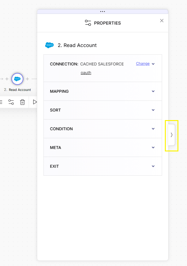
Many configuration fields support dynamic values—pulling from earlier steps or passing to future ones.
- When dynamic values are available, the Data Kit opens automatically, indicated by an inward-pointing arrow on the field’s right side.
- You can collapse the Data Kit using that arrow.
- If the Data Kit is collapsed, an outward-pointing arrow lets you open it again.